Designing a website is notoriously difficult. There are so many elements you need to develop that not only look good but function seamlessly to support your customer and ultimately guarantee you the sale. But what are these elements? How should they look? And how can you make sure that they work?
In this ultimate guide to website design, we take a deep dive into the best practices of eCommerce website design. We will focus on how to develop the perfect website infrastructure to help sell your products, we’ll also focus on the importance of the users’ experience and how to optimise this so that your customers convert at the checkout.
Contents
- Ecommerce Platforms
- Ecommerce Website Architecture
- Ecommerce Navigation Best Practices
- Best Design For Category Pages
- Best Design For Product Listing Page
- Ecommerce Checkouts That Can Improve Sales
- Inventory And Fulfilment Best Practices
Ecommerce Platforms

The first thing that you will need to consider when designing your website is what platform you use to develop your site.
You will need to factor in a few things here to make sure you have catered for how your website will operate, how much traffic you anticipate that you’ll get, and how you want your site to look, feel, and work.
You will need to consider:
1. How You’ll Host Your Website
There are 3 different options when it comes to choosing how to host your eCommerce website. These are Saas, Paas and Iaas.
SaaS – This means “Software As A Service”, which refers to a third-party software provider who will host your website using a pre-existing program or package, such as Zendesk or Mailchimp.
PaaS – This means “Platform As A Service”, which refers to a third-party provider which will provide both the hardware and software to host your website, an example of this would be the Google App Engine.
IaaS – This means “Infrastructure As A Service”, which refers to a ”Pay As You Go” type of service via the internet, with an example of this being Amazon Web Services.
2. Select The Right Ecommerce Platform For Your Business
Once you know how you are going to host your website, you will need to look at specific platforms on which to design and build your site.
There are lots of options for eCommerce websites, including Shopify, WordPress, BigCommerce and Magento.
Which platform will choose will depend on:
- What programming language does the platform use and do you (or your team) have the skills and time required to customize the site.
- Will you need to pay to use the platform?
- Does the platform allow you to sell your products? Many stores have options to sell both digital and physical products, for example, a photographer may sell digital prints along with physical prints and so would need a platform which allows them to sell both.
- Which payment gateways are supported by the platform.
- Whether it integrates with your chosen shipping service.
- Is it easy to customize or will it require coding?
- Does it have 24/7 support if required?
For more detail and advice about how each platform benefits and works for your eCommerce website, read more information about the different website platforms in Ecommerce Website Development: Which Platform?
Basic Ecommerce Website Architecture

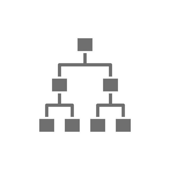
When it comes to designing a website, the next thing that you need to carefully consider is its architecture. Just like building a house, it’s important to get the foundations right so that there is something solid to build on.
Website architecture includes everything from URL structure and page structure, to categorization, menus, and navigation, to how the pages are linked to and from each other. You’ll need to consider each one carefully to understand what works best for your website, your customers, and your ecommerce SEO. Because your website architecture can affect your customer journey, your bounce rate, conversion rate, and how well you rank in search engines.
You will need to consider how your architecture can:
1. Help Customers Find What They’re Looking For
How you structure your website can help customers know where to look. Think of your own online shopping experience to help you know what works and what doesn’t.
When you land on a website, it should be obvious where you need to navigate to find what you’re looking for. Often that means having a clear navigation menu with clear categories and links.
Be careful to put yourself in your customer’s shoes here. It can be easy to think your navigation structure is easy to navigate because you created it and you know your products inside and out. However, often customers who aren’t familiar with your brand or your products yet might not find it quite so easy to navigate. This can lead to high bounce rates and low conversion, so make sure you test your proposed structure with a variety of people to make sure it works for everyone.
2. Make Sure You Have A Solid URL Structure

Whatever site structure you decide to present in your navigational menu should then be mirrored in your URL structure.
Your URL structure is all about the paths after your domain name. It should make sense to both people and search engines as well as be as simple as possible. Making sure that there is some logical sense to the way that your URLs are structured and displayed, allows customers to be able to see the pathway that they’ve navigated to a product.
- SSL (Is it HTTPS)
- Ecommerce store’s domain
- The category
- The subcategory (If product falls into a subcategory)
- The name of the product
Having a logical and simple URL structure that is consistent across your site is great from a User Experience (UX), but this also means that Google and search engines can understand what your pages are about and how they relate to each other.
3. Make A Decision About Filtered Navigation

Your category pages are an extension of your main navigation, which means they are another important factor in your overall site architecture as they can affect how a customer navigates your website.
Filtered navigation is an important part of how customers use your category pages. They give customers the ability to filter your products based on your attributes, which also means that you need to work on how your products should be categorised eg. based on size, colour, weight.
However, to keep your site structure SEO friendly, you will also have to consider how you handle your filtered navigation in terms of any additional URLs that they generate. Most filter navigation for eCommerce websites generate query URLs, however, these aren’t necessarily SEO friendly as they create lots of pages causing duplication issues and index bloat.
4. Don’t Be Afraid Of Breadcrumbs

Another element on your category pages that you can use to improve and support your site architecture are breadcrumbs.
Breadcrumbs are the linked text path at the top of a category, product, or blog page that shows where a user currently is on a website. Having these breadcrumbs allows users to navigate back to where they’d like to be if they can see the path that they arrived at a specific product.
Although breadcrumbs sound insignificant, they can have the potential to make customers stay on your website and purchase additional items by using breadcrumbs effectively.
5. Think About Pagination

Your category pages are likely to have long lists of products that don’t fit on your standard page. So as part of your architecture, you will need to decide how you treat these lists.

You have options like a ‘load more option’, which keeps all products on one page. Or you have the option of using multiple pages, known as pagination.
Whichever option you decide, you need to consider how this solution will load on mobile and desktop. Be careful that your choice does not cause increased page loads or problems with duplication.
For more information and advice about the best practice when it comes to building your site architecture, read our UX Guide To Website Architecture For eCommerce Businesses
Ecommerce Navigation Best Practices
Once you have a clearer understanding of how your site will be structured and where pages will fit with one another, you can start to build out your navigation and menu bars.
This includes your navigation menu and any other links in your header, like shopping cart, currency options, and language versions.
You will need to consider:
1. Make Use Of Widely Accepted Symbols

Symbols can help to convey your message in fewer pixels. However, there are a few things that you need to consider when choosing which symbols to use where.
Customers become used to seeing the same symbols across various sites and can easily recognise and understand how to navigate a website based on these icons. For example, a customer may have shopped on multiple websites where a trolley or cart is used as a symbol for the checkout area.
If you have decided to use the symbol for currency as a way of navigating to the checkout, this could easily confuse a customer who may think that this symbol is used for changing the currency on the website. So keep it simple, don’t overcomplicate things with edgy icons.
2. Put The Main Navigation In An Obvious Location

Customers also get to use the places in which they need to go to navigate a website. So try not to add more confusion to the shopping experience by adding the main navigation to a quirky image or side banner which makes no logical sense to the customer.
Consider adding the main navigation either horizontally across the top of the page or vertically down the left-hand side of the page. These are the standard places that websites all over the world will place their menus, so customers know where to go and how to use them.
Don’t forget to consider the placement of your menu on desktop and mobile. Sometimes designs mean that the mobile version of your site will need to look slightly different due to space. So consider the ways in which you can keep your layout as consistent as possible.
3. Have A Clickable Logo

Customers also get used to being able to use your logo to navigate. On most websites you will visit, clicking the logo in the top left of the page will direct you back to the homepage.
This is something that you should consider for your website as it will help customers know how to navigate your site.
For more advice and examples of good website navigation, read our UX Guide To Ecommerce Website Navigation In 2022
Best Design For Category Pages

Next on your list of decisions for your web design is the look and feel of your pages. It’s important to build high-converting category pages with the best category page design possible.
Category pages are one of the main methods that users use to navigate your products, but depending on the platform that you have chosen to use and whether you have development support or not, you might be limited to the design you can have.
Regardless, you will need to consider:
1. Visual Cues
It’s important to make it very obvious to customers where they are onsite and where that page is in relation to what they are looking for.
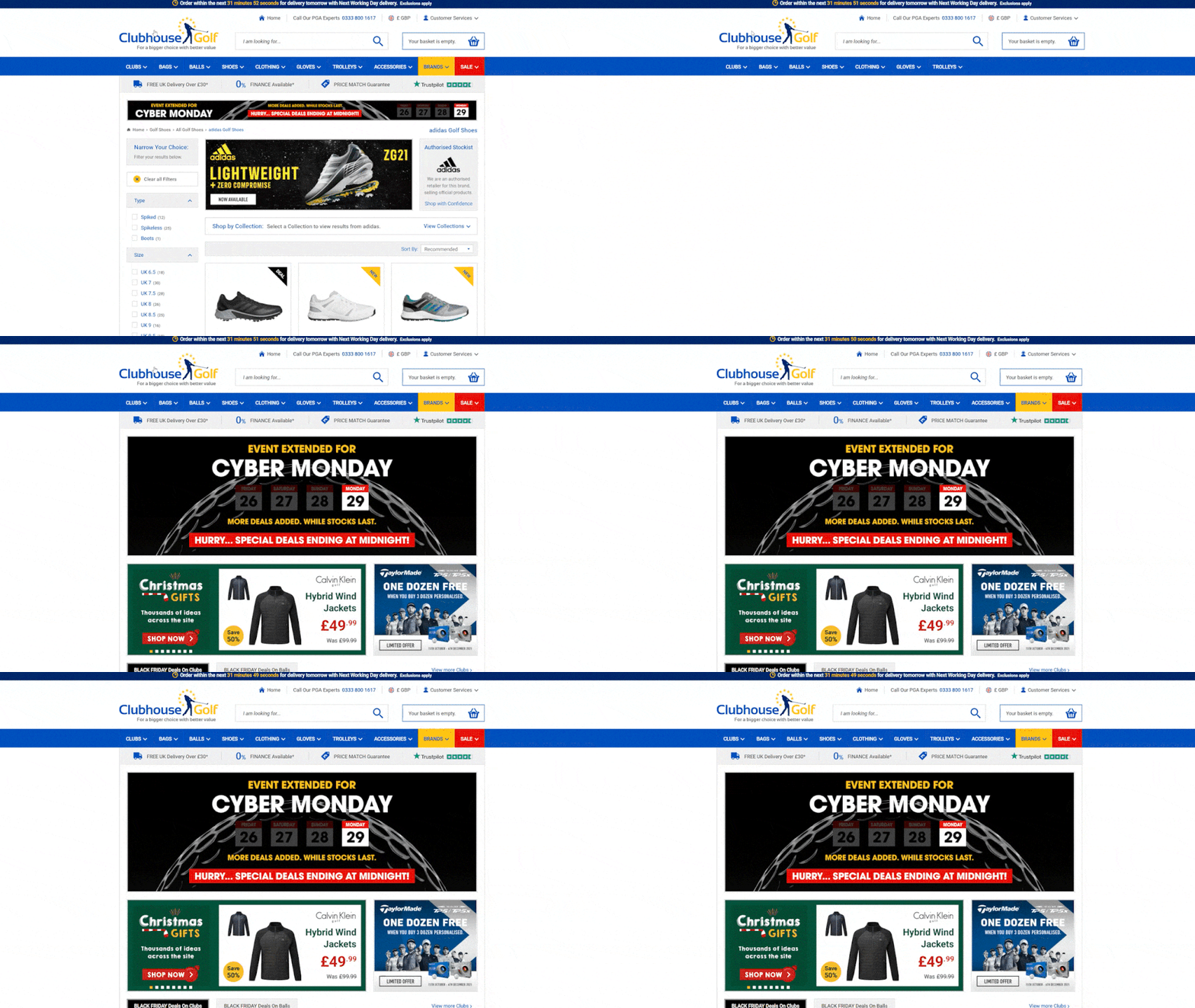
Banners can be helpful to this end. They can identify the title of the category page the customer is on and suggest other categories they might be interested in. However, try to steer clear of using overly complicated or intricate graphics, as this can hinder a customers’ navigation around the site.
Body text or page content can be helpful too. It can hero out key lines as well as provide more information about how you serve the specific category. This type of content is also extremely important for SEO as it helps Google to understand what your page is about and gives you a chance to provide real value to its searches in the form of answers to common searches. However, be careful how much text you add at the top of your category page as you still want your product list to appear above the fold on all screen resolutions.
2. Clean Layout
How many of your products appear above the fold will also depend on the layout that you use to list your products.
While rows are one of the most popular ways of structuring a category page, there isn’t and shouldn’t be a “one size fits all” approach. So using columns could be more visually appealing for your products and provide more information than using rows.
Look at what your competitors are doing and what works best on different devices.
Best Design For Product Listing Page

You will also need to make decisions on the look and feel of your product pages. These are the penultimate pages in your customer’s journey to conversion and are just as important as every other page.
So you will want to optimise their design for conversion. But you will also need to consider how their design might impact the ways in which you drive traffic to them, like SEO and PPC. Your design choices will need to work for these channels too.
So you will need to consider these product listing page best practices:
1. Provide Great Product Images

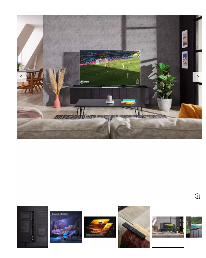
It’s hard to get a feel for how a product will look or perform until you physically see it in front of you, so it’s important that you’re providing customers with as much visual detail as possible.
Using product images is one of the ways that you can give the customer as much detail as they need. Adding in a video of the product as well can really help to bring the item alive and allow your customer to decide whether this is the best choice for them.
Make sure that your product page design allows for high-resolution images on a clean, white background, and enables you to add multiple images of multiple angles. This should help to increase conversion while also reducing the number of returned items that you receive.
2. Provide A Lot Of Product Information

Although visuals are important for customers, there is some information that you just can’t get from images alone. So it’s important to provide enough written detail on your product pages as well.
Writing about the features, benefits, and functionality of your product will also support your marketing efforts as search engines will look at the information on your page in order to rank it for SEO and score it for ad relevance for PPC. So the more useful information you can write about on your product pages the better.
This also includes reviews too, which will add written value to your customers and also search engines.
For more advice on product descriptions read our 9 Steps To Write A Product Description That Sells
3. Show Related Products

You might also want to consider how the design of your product page allows for upsells and cross-sells.
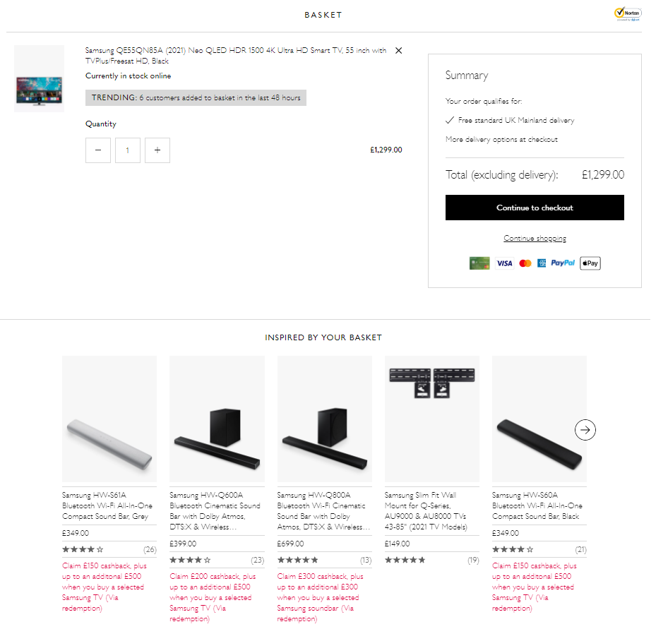
Aside from the checkout page, the product listing page is really one of the last places where you can try to influence a customers’ buying decision or assist them with finding other products that they may find more appropriate for their search. So adding a related or recommended items scrolling banner at the bottom of a product listing page is a great design element to let you showcase more of your range and increase the chances of an incremental sale.
Ecommerce Checkouts That Can Improve Sales

The design of your checkout is just as important as the design of the rest of your pages. The checkout page is the last place that you can assist a customer and influence their buying decisions.
So you should consider:
1. Use An Obvious Call-To-Action (CTA)
The aim of every call-to-action button is simple – encourage a customer to act. So it’s important to carefully place the CTA on your checkout page to avoid confusion and fewer abandoned baskets.
When it comes to designing your checkout page, consider making the CTA buttons on your checkout page bright, obvious and simple. This will allow customers to have minimal distractions when trying to place an order, which should reduce the abandoned basket rate of a website.
2. Be Transparent About Shipping Costs
Even if your CTA is placed and designed optimally on your checkout page, there are many barriers to purchase that might cause a user to abandon their basket.
One of the most common reasons is that they weren’t aware of the shipping costs until the very last stage of the checkout process. This is where the customer is most likely to convert, so by not making shipping costs clear enough, you are losing easy sales.
When designing your checkout process, ensure that the customer can see the estimated shipping costs at any time during the checkout process to limit the abandon rate.
3. Provide Multiple Payment Options

Providing insufficient or time-consuming payment methods can also prevent a user from completing the checkout process, so consider how well you can integrate different options when developing your checkout.
With the rise of “buy now pay later” options such as Klarna making such a big impact in the eCommerce arena, it’s always a good idea to keep on top of trends and be flexible in your checkout development to allow for additions later.
For more advice and examples of payment methods, read our Guide to the Best Payment Methods for Maximum Profit
Inventory And Fulfilment Best Practices

Once you have supported your user through the shopping and checkout process, you also have to be confident that your eCommerce website will be able to handle the orders.
For this, you will need to make sure that your inventory and fulfillment software is adequate for your business. So you will need to consider:
1. Accuracy
There’s nothing more frustrating for a customer than waiting for their order to arrive, only for them to realise that the wrong item has been delivered. It can be bad for your brand, customer trust, and your profit margins.
Keeping your inventory listings accurate and having multiple checkpoints from a fulfillment perspective will help to avoid this problem.
2. Offer Different Shipping Options
While many customers are attracted to free shipping, if this isn’t an option for your business, then having different shipping options for your customers to choose from will often encourage them to continue with their purchase.
However, make sure that your fulfillment software provides this option and that it can report on parcel numbers and shipping costs so that you can keep on top of profit margins.
3. Be Responsive
Mistakes happen to everyone and every business. But how you handle those mistakes is what makes or breaks your reputation in the eyes of your customers.
If a mistake has caused a customer to have a delayed delivery, the worst thing a business can do is to try and hide this fact or not communicate openly with a customer to resolve this. Most of the time, a delay in shipping can be resolved by alerting the customer to the issue and offering either a partial refund or a discount off their next shop. Committing to being open and honest will almost guarantee that a customer will think more highly of your brand and will be more likely to shop with you again in the future.
So consider whether your software allows you to easily check on problems and give you the tools in which to communicate with customers.
For more advice and examples of inventory and fulfillment software, read our 5 Best Shipping and Fulfilment Softwares For Managing Ecommerce Orders in 2022