Previously, I wrote about the psychology behind design, and a brief part of this was about fonts and typography. Today’s blog expands on this subject, as a font can say a lot about your business. Whether it’s the logo on your website, or a large shop front sign on the high street, it is often the first thing a potential customer will see of your business.
As mentioned in the previous blog, this all comes down to psychology; what do you want your branding to say about your business? Those that know me will know I have a particular aversion to one certain classic font who shall remain nameless. Actually, no it won’t, it’s Comic Sans. It deserves to be named and shamed because it’s a horrible font and should not never be used. The reason for this, you will hopefully understand by the end of this blog. For the record, a good “brand” is way more than just a font – but that will be another blog.
Fonts represent different characters and can tell the end user a lot about the company at hand. For example, let’s have a look at the logos for Disney and HSBC.

Both companies are very large corporations, but both have a very different commercial output. HSBC, as a banking corporation, needs to be portrayed as a serious and reliable business built on stability and trust. Disney, on the other hand, needs to portray fun, friendly and a family orientated image. Both of these logos serve those purposes perfectly. HSBC uses solid capitals in a serif font, whereas Disney has loops and swirls and a ‘fun’ dot above the ‘I’. Imagine if HSBC tried to be ‘fun’ and Disney tried to be corporate?

The less said about these, the better. They simply don’t work. Font choice is not as simple as choosing one you like (no one should like chalkboard though, by the way), you have to consider the voice, tone and nature of your company.
A good logo design is imperative. A high quality, well thought out logo will always work better than one that has been chucked together without thought. For example, have you ever noticed the arrow in the Fed-Ex logo, the ‘A to Z’ in the Amazon logo or the Spartan in the… well, Spartan logo? The logo speaks for the nature of the business and users may psychologically pick up on this aspect, not just read the company name.

On the other hand, who says a good logo needs words at all? I’m sure you’ll all recognise these two brands, but that’s for another blog entirely!

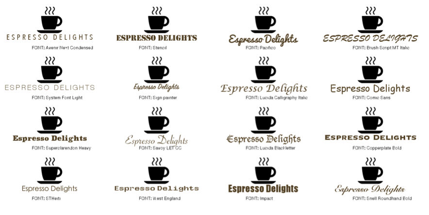
To give another example of how a business’ image can be affected by the logo font choice, I’ve created a fictional coffee company called ‘Espresso Delights’. In this example, Espresso Delights are a young coffee company, offering up great espresso. The new generation of coffee lovers is seen to be quite hipster, so they may want to try and appeal to that audience. For this ‘workshop’, if you will, I’ve created this contact sheet of potential logos. Some, I have designed to look nice, some I have deliberately made to look horrible (in my opinion). In the comments, it would be interesting to hear what you think looks good or not.

So firstly, let me discuss some of the worst offenders. At the top of that list is, of course, Comic Sans. Comic Sans makes the logo look cheap, childish and more like a roadside truck stop than a sophisticated and modern establishment. The same could be said for Lucida Calligraphy Italic. Lucida Blackletter makes it look like a medieval script. Whilst the middle ages look doesn’t work for this, it doesn’t mean it is a ‘bad’ font, just not right for the job. Stencil is also not great as it looks too serious, almost military like. However, if the shop in question was decorated with rustic exported coffee boxes and bags with the logo stencilled on, it might just work, but maybe with a different company name. ‘Espresso Delights’, as a brand name, offers up some elegance, which should be taken into consideration. On that note, the italic fonts like Sign Painter, Savoy LET CC and Snell Roundhead Bold look OK, but for me, all too ‘mid 90’s cafe in a shopping centre’.
From this list, for me, there are four that stand out as decent. Namely ‘Pacifico’, ‘System font light’, ‘STHeiti’ and ‘Avenir Next Condensed’. Pacifico is a modern, fresh, fun font that says relaxed. The only reason that I don’t like it for this is that the coffee cup looks unbalanced. For me, the winning choice would have to be STHeiti. It is clean, clear and modern and portrays everything that it needs to for this particular coffee company.
Evolving over time
The last thing to consider when choosing fonts and designing a logo is that something that worked once, might not work now. There’s a reason so many companies update their logos; it is important to stay relevant in the current climate. This applies not just for your logo, but also for your company’s voice and tone, website, social output and product base.
Take a look at how the Pepsi logo developed over time.

They’ve had a few other logos, but I’ve used a select few to show the general progression. Pepsi have consistently modernised, and logos that may have looked ‘cool’ or fitted the target market at the time now look dated or even vintage. Pepsi were also early adopters to the idea of a symbol making up part of the logo. Nowadays, you can see the red, white and blue circle and know that it is Pepsi, even without the text. How many other companies, aside from Apple, Twitter and Pepsi already mentioned, can this apply for? Nike, Adidas, McDonalds, Android and even the Rolling Stones to name but a few.
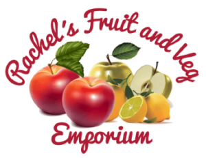
So, to summarise, your font choices can really affect the mind-set of your target audience. I have focused this blog specifically towards logos, but the same sort of rules apply for anything with a headline. Font choice is equally important throughout your website and I may well do another blog on that subject in time. Generally, you will just need a clean, readable and modern web-friendly font nowadays, but there’s a reason why many thousands of fonts exist, because they all have a place somewhere in the market… except for Comic Sans. To end, one last example: I very quickly put together two logos for a fictional fruit shop: which one would you be more likely to shop at?


I say quick, because good logos and good branding take time, thought effort and a lot more than just a font.
If you would like help with re-branding or a new logo, speak with us today about about our digital marketing services