The success of an eCommerce website can fall down to just one thing: accessibility. That means that if a customer can’t find your site or can’t find your product, then they won’t convert no matter what your price point or USP. So how accessible your website is to customers is a big deal to your business.
But most eCommerce websites don’t make it easy for their customers, or for search engines, to find what they are looking for. Their website architecture leaves a lot to be desired, which means it’s hard for customers to navigate. So what is it that an eCommerce business needs to do to improve their website architecture to help customers and search engines access their content?
What Is Website Architecture?
Website architecture is all about how content is organised on your site. Good website architecture has been planned well and integrated into the site’s design in a way that helps users and search engines to find the information they’re looking for quickly and easily.
It can be time-consuming to structure your website, especially if you have a well-established site with lots of URLs. But grouping your content, linking between your pages, and establishing a hierarchy can have a big impact on how well your site performs.
Why Is Website Architecture So Important?
1. Conversion Rate
Website architecture helps to provide a good user experience for your customers. A clear structure can help them to find the pages and information they need quickly and easily. Typically, the quicker and easier the journey for the customer is the more likely they are to complete the journey and convert.
You will probably have had the experience shopping online yourself where you have struggled to find a product or struggled to complete the checkout and ended up leaving the site to find what you wanted elsewhere.
2. SEO
These user signals are important to search engines. So if you can provide an experience that is better than your competitors, then you will have a slight edge when it comes to rankings.
But good website architecture can also help your rankings by improving the way that Google crawls your site. This means that you’re helping Google, not just users, discover your content and make sense of your content by providing context and structure. For example, it would be hard to understand a book if all the pages were jumbled and the chapters were not in the right order.
Website Architecture Best Practices
Implementing good architecture to your website involves creating structure in several aspects of your website, including:
- Navigation
- URLs
- Category Filters
- Breadcrumbs
- Pagination
- Canonical Tags
1. Navigation
Your navigation, sometimes known as a menu, is important to users and search engines. It’s how most will discover your pages and navigate your site.
Your navigation should be made up of 3 elements: main menu, additional menus, and search function. Each should keep things as simple as possible so that customers and search engines can find their way around easily.
Main Menu
This is usually the first place on your website that your customer and search engines will engage with. It should also be consistent on every page of your website.
To maximise your main menu, avoid stuffing it with as many URLs or features as possible. Although it can be tempting to showcase as much of your website as possible, it can actually have the opposite effect. Too many options in your menu can be confusing and look spammy to Google.
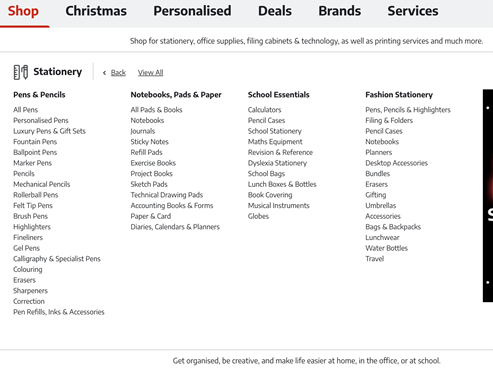
An example of how to streamline your main menu while also featuring key pages is the Ryman stationery website.

Also, don’t forget that your menu needs to be rendered without Javascript because search engines can’t see javascript.
Additional Menus
One way to keep your main menu clear and simple is to use additional menus, otherwise known as dropdowns. These typically feature subcategories once the main category is clicked on, and open up to provide more links to more pages of the website. Their aim is to help users and search engines to navigate.
Again, look at how Ryman stationery has handled their additional menus, which feature key subcategory pages:

Search Functions
Users can also navigate your site with a manual search, usually from a search bar that is accessible from the main menu. Although a search bar isn’t useful for search engines, and in fact could create index bloat unless search query URLs are marked as noindex in the robots.txt files.
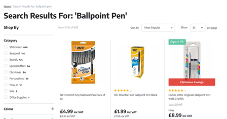
However, how well these search results work for your customers can be reliant on how well organised the rest of your site is as the search function will usually search for key phrases in your URLs and page copy.
In Ryman’s case, their search results pull key phrases from product titles:

2. URL Structure
Your URL structure is important for users and search engines too. It helps to signpost what the page is about and where it sits in relation to other pages on your website.
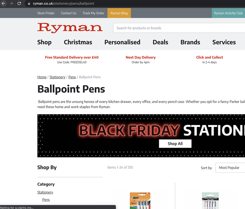
For example, Ryman’s URL structure follows the site’s category structure of: domain/category/subcategory/subcategories

This structure is clear and easy to navigate for users and search engines as they can understand where the page sits in the user journey and what to expect when they land on the page.
TIP: take into account the below factors when deciding on URL structure:
- Construct URLs with natural and logical flow, which make sense
- Use hyphens rather than using spaces or underscores
- Keep the URL below 70 characters where possible, so that this appears cleaner and easier to navigate
3. Category Filters
Category filters, sometimes known as filtered navigation, are a feature on category pages for eCommerce sites. They are a quick and easy way for customers to find the product they’re looking for based on the product’s features. These features could include factors such as size, colour, material, price, and more that help to filter the product results on a category or search page.
For example, Ryman offers the following feature filters for their pens category:

However, although these category filters are very useful for users and ultimately help conversion, they are usually not search engine friendly. This is because, like search pages, they create query URLs. So you should decide whether you should noindex these pages too via robots.txt or whether you should invest in development support to make category filters create static or absolute URLs.
4. Breadcrumbs
Breadcrumbs are small text paths that tell users and search engines where the page is that they are viewing in relation to the other pages on your site. This can help users to navigate easily back through your website, while also providing information to search engines about the topic of the page within your site’s hierarchy. Implementing breadcrumbs is also an easy way to improve your site’s internal linking.
For example, the Ryman website features breadcrumbs at the top of the page, which reflects the site structure path that the page has. In the case of a subcategory page, the breadcrumbs follow: home > category > subcategory > page

5. Pagination
For URLs like categories and search pages where there are too many products to fit onto one page, pagination is important. This enables products to be split across multiple pages, making it more manageable for customers to shop.
Usually, as is the case with the Ryman website, these paginated pages will create a query parameter onto the page’s URL, e.g. ?page-2.

Previously, using the HTML attributes rel=’prev’ and rel=’next’ tags advised search engines that these pages are connected. Although these tags can still be implemented, search engines can now understand paginated pages without them.
Summary
How your website is structured is as important to users as it is to search engines. Your structure should indicate how pages are related, what the pages are about, and where to navigate for certain results.
There are some elements of your website, such as your main menu, search pages, URLs, and breadcrumbs, that can make more of an impact than others on how users and search engines understand your site. So extra effort and planning should go into optimising them.
However, it is important to understand that although your website architecture is important for users converting and search engine crawling, there are lots of other factors that will affect your site performance too.
Related Ecommerce Insights